Recipe
RIP starting points
Start your RIP with the supplied ICC profile, print a test chart and adjust one setting at a time, so colour stays steady without guesswork.
I’m Fatiema Pandy, and my job at DTF Ink is helping our clients get the most from their software and inks, especially with colour accuracy. DTF has its quirks, but you don’t need a spectro bench or a pile of lab coats to get credible results. Here’s how we approach RIP and ICC basics for South African conditions, without losing shop-floor sanity.
Set your environment before profiling
Before you touch your RIP settings or worry about ICC profiles, stabilise your print room. In South Africa, we see huge swings in humidity, especially between the Highveld’s dry winters and coastal humidity. Aim for 45 to 60 percent relative humidity and 20 to 25 degrees C. If you’re powdering by hand, static from dry air can spoil registration and make powder scatter, which definitely affects colour consistency.
Keep your film sealed and flat, and let your inks come up to room temperature if they’ve been in a cold storeroom or bakkie overnight. White ink that’s settled or thick will throw off your underbase density, so always agitate white daily and run a circulation cycle if your printer has one.
Use the RIP’s DTF presets as your base
Most commercial DTF RIPs include starting-point media and ink settings for common PET films and water-based pigment inks. Don’t skip the factory DTF profile as your baseline, even if you plan to make your own tweaks later. Pick the closest match for your ink and film type, and note if the preset expects hot peel or cold peel film, the underbase and colour balance can differ.
Avoid using generic photo paper or canvas presets for DTF. They often pump too much ink or have the wrong dot pattern, leading to bleeding, choked detail and unreliable colour.
Adjust white underbase and colour limits by eye
The white underbase is everything in DTF. Too heavy and the print feels stiff, too light and colours look faded, especially reds and oranges. Start with the RIP’s recommended white level, usually around 120 to 150 percent underbase for standard cotton, and test on your job fabric. For midweight tees, I usually lower the underbase a notch if the print feels too raised after pressing, but don’t go below 90 percent or fine lines will lose body.
Colour limits can be nudged by running a basic test chart from the RIP: look for grain or bleeding in heavy fills. Most DTF jobs want total ink limits between 200 and 260 percent (CMYK+W), but check how your powder melts. Over-inking can make powder run into the image or cause speckling during cure.
If your print looks dull or off-colour, check the white first: weak white will always drag down colour vibrancy.
- Start with factory DTF ink/media presets
- Agitate and check white ink before test prints
- Adjust white underbase in small steps
- Run a nozzle check before profiling
- Watch for bleeding and grain in test charts
Check your output and tweak ICC use carefully
Once you’re happy with the basic output, print a real customer graphic and check how your profile handles it. South African sports kits, school uniforms and promo wear often use bright spot colours and deep navy or black. If you see strange casts or washed-out primaries, try the manufacturer’s ICC starter pack supplied with your RIP. Don’t stack or combine profiles from different sources, one at a time only.
Save tweaks as custom presets in your RIP when you find a setting that works, but re-test every season change. Highveld air in July behaves very differently from Durban in February. Avoid chasing perfect numbers, focus on sharp, durable, and believable colour on your actual fabrics.
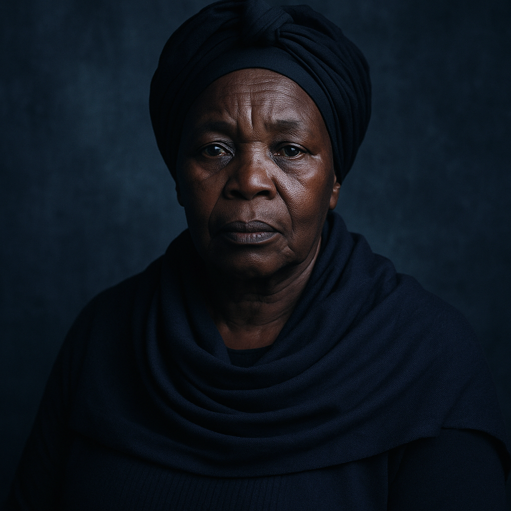
Colour and RIP specialist at DTF Ink. Owns colour control, RIP setups and underbase tuning for darks.
Related
Talk to DTF Ink
Tell us about your printer, film, powder and press settings and our team will help you get repeatable transfers. Meadowdale lab in Germiston, plus seven studios.